Role
Product Designer
Teams
UX, PM, Engineering
Duration
6 Weeks
Platforms
Mobile, Tablet
We saw a weak conversion rate in our monthly premium subscription among first-month users, causing a revenue gap. I led the launch of the Welcome Pass, a shorter, more affordable option that introduces new users to premium content.
1.2%
in new user conversion
+13%
in weekly engagement
22%
of sales are from recurring users
+6%
in revenue growth from new users
TL;DR
PROBLEM
Only 0.6% of new users purchased the premium plan in their first month.
Data showed that while new users often spend on other in-app purchases, the monthly subscription is doing poorly with new users.
SOLUTION
Welcome Pass, a 7-day plan tailored for new users.
The Welcome Pass is a 7-day subscription plan designed for new users. It’s offered at a lower price point with reduced gameplay requirements, making it a low-commitment way to enjoy premium content.
BACKGROUND
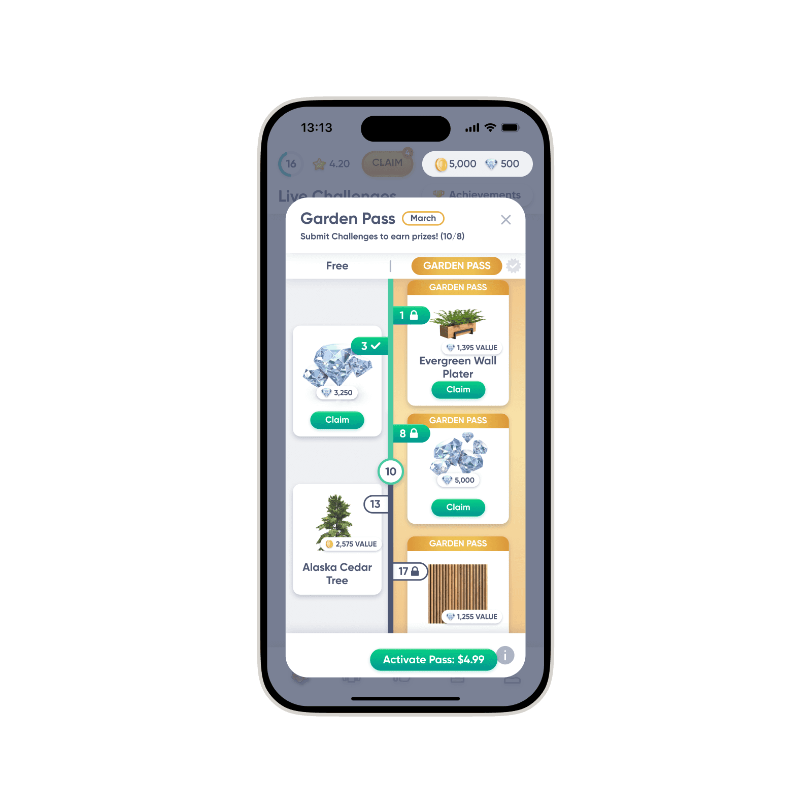
Garden Pass: a monthly battle-pass-like subscription.
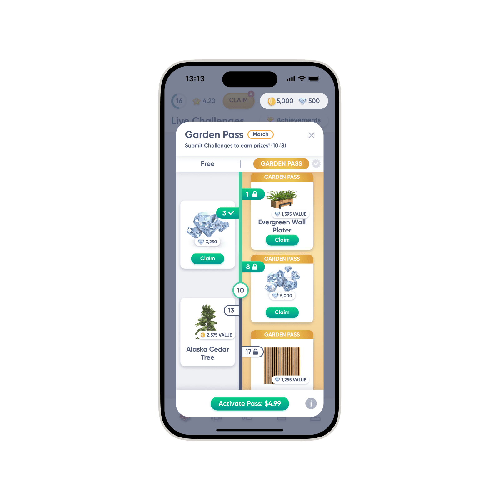
Current Garden Pass.
PROBLEM
Only 0.6 % of first month users purchased the subscription.
Poor value for users who join late
Users who joined mid-cycle couldn’t justify the purchase.
Confusing UI and progression
The interface was confusing, casual users tended to ignore it rather than learn it.
Despite the high purchase intent, bad timing and poor visual clarity were causing low conversion.
The UI was suspected to be causing low conversion rate.
EXPLORATION
I explored a few solutions, but they all had trade-offs that could not be ignored.
Easy implementation
Disrupts the content cycle
Value that matches join date
Complexity & revenue risk
Beginner-friendly value
Risk of drop-off for early joiners
PROPOSED SOLUTION
The Welcome Pass:
a 7-day, new-user-only plan.
Reduced gameplay requirements
Lower price with reduced gameplay requirements.
Available only for new users
Available during the first 7 days since onboarding.
Offered in addition to the monthly plan
Users can choose to purchase one or both plans.
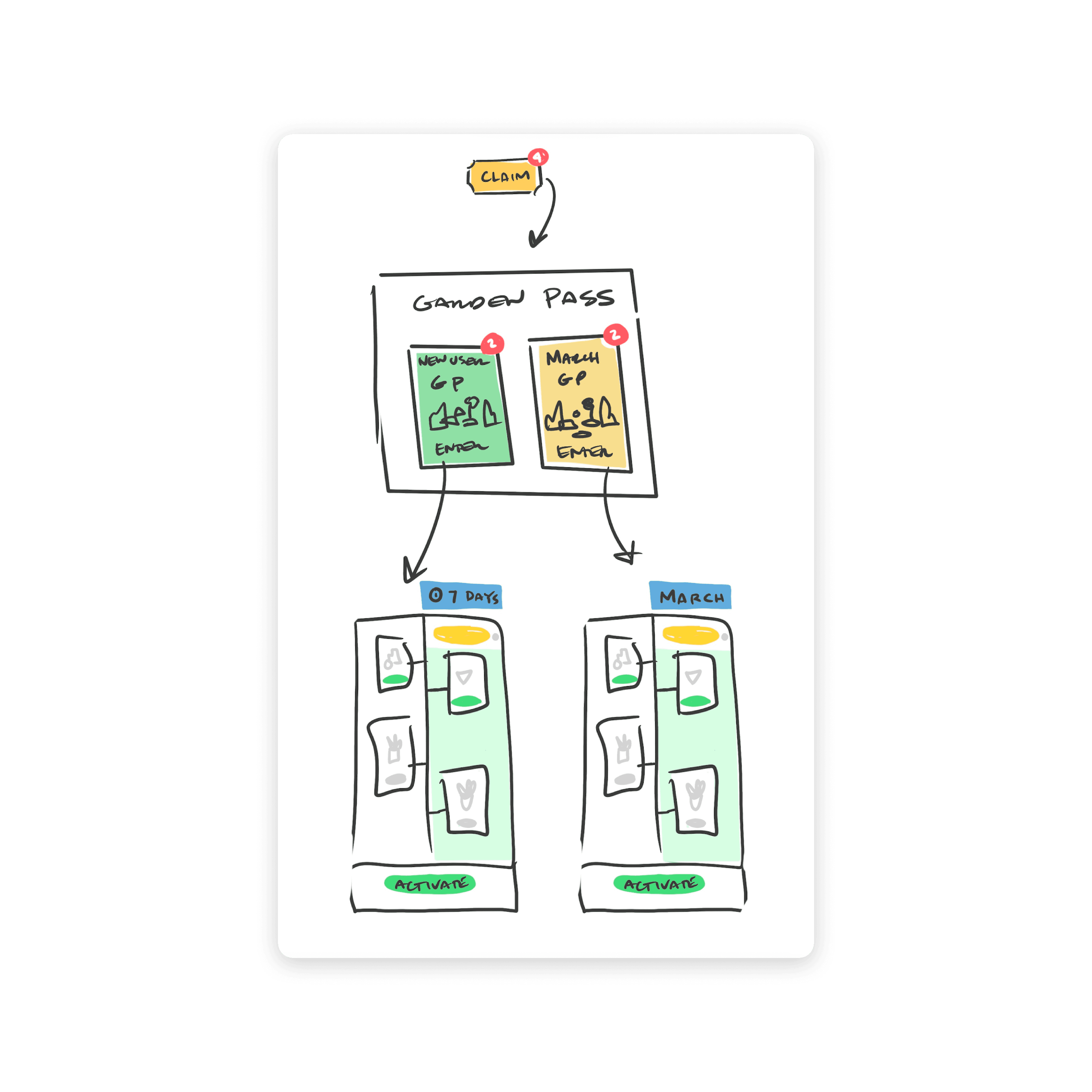
Early concept of the Welcome Pass
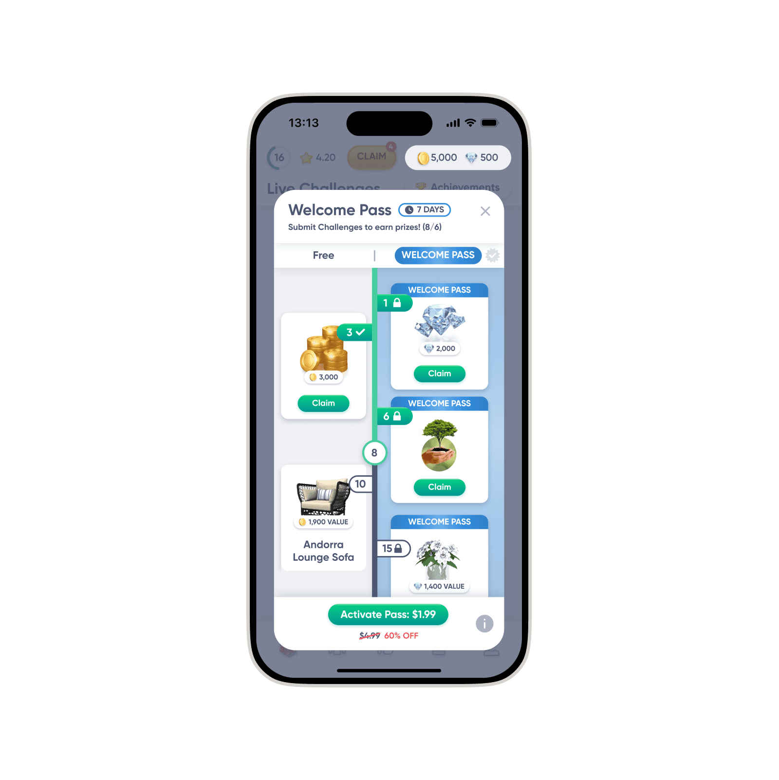
Welcome Pass MVP.
UI IMPROVEMENTS
The new UI needed to reduce the learning curve and indicate progress more clearly.
Removing friction in the flow
I removed an extra tap in the flow that was causing drop-off.
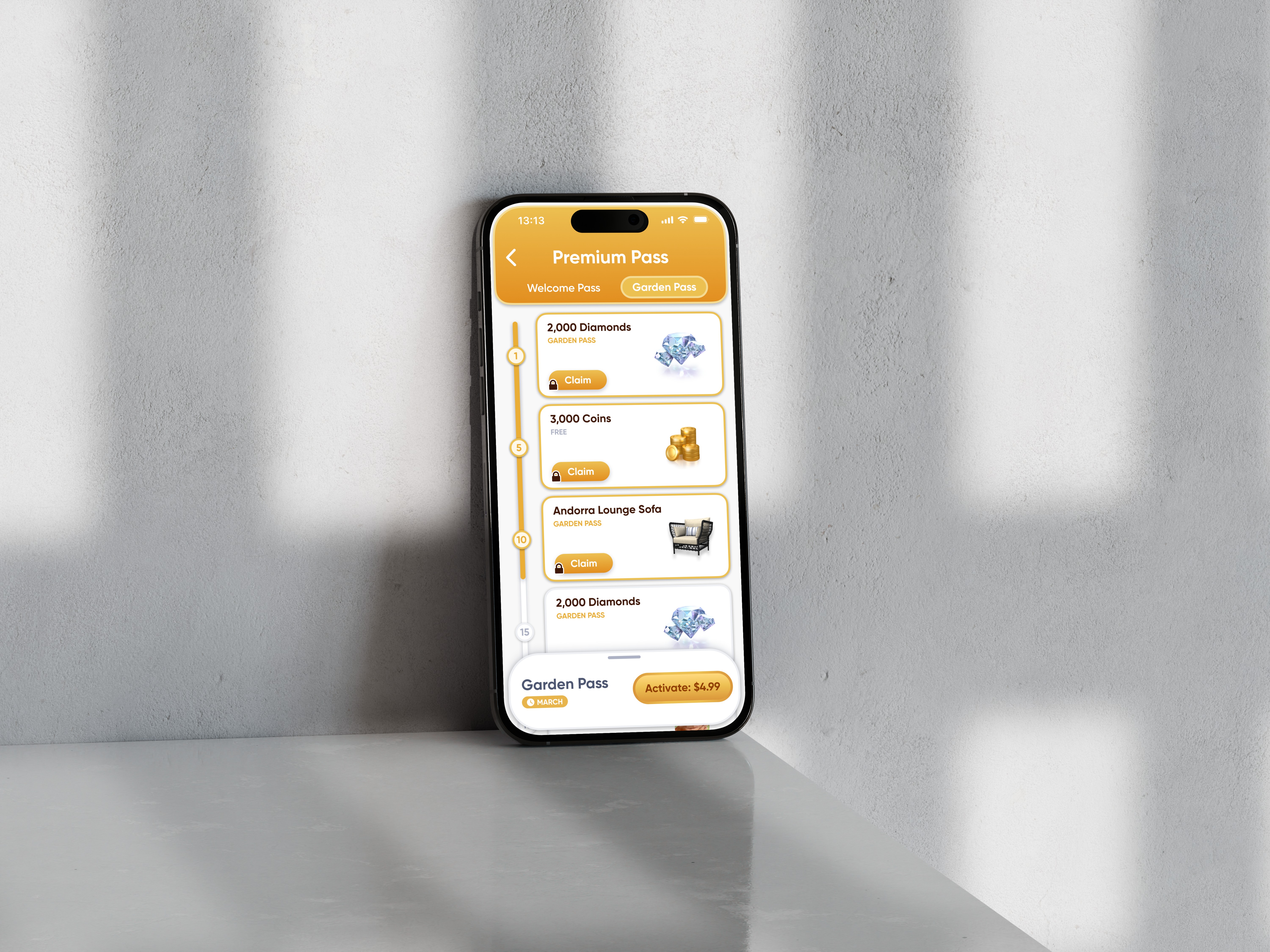
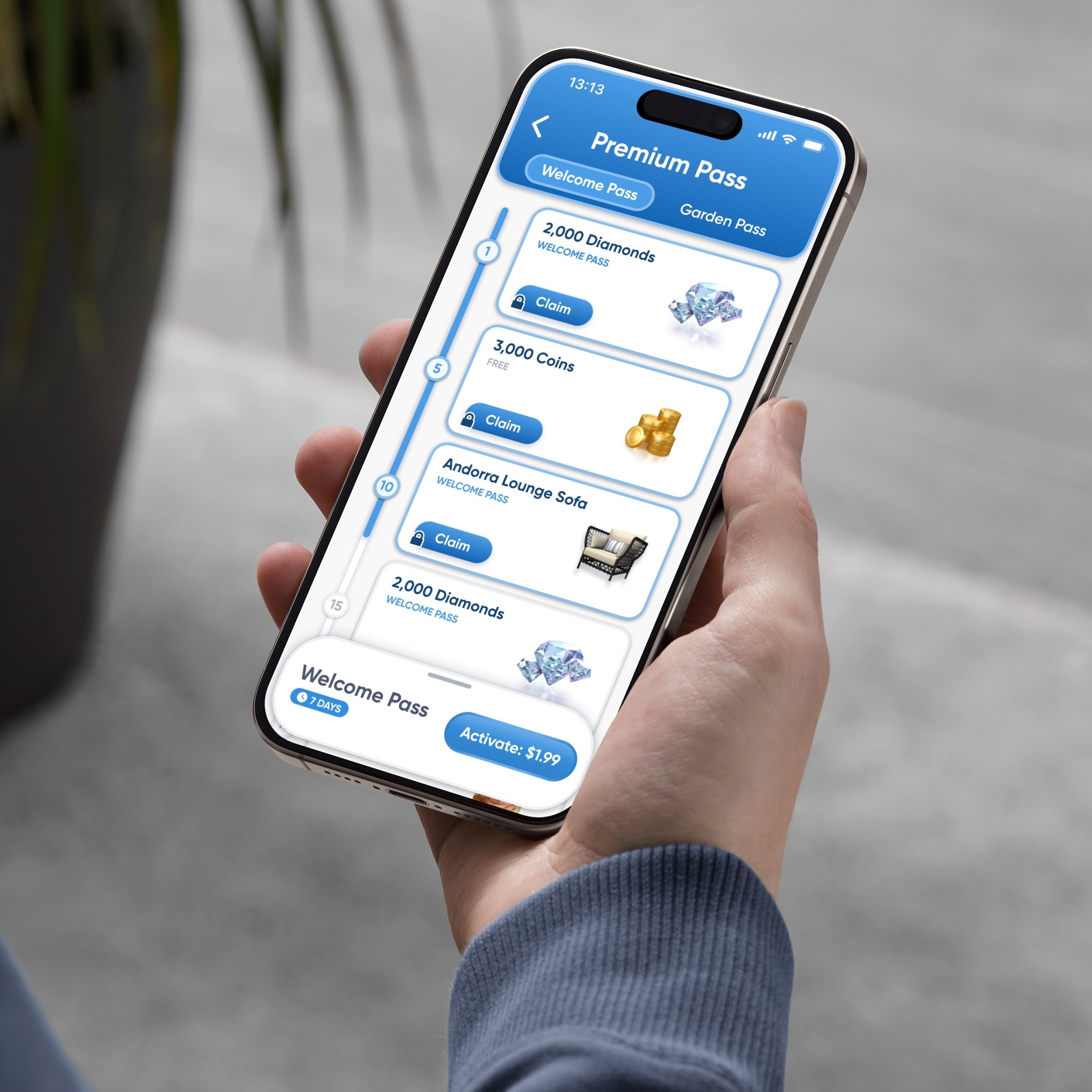
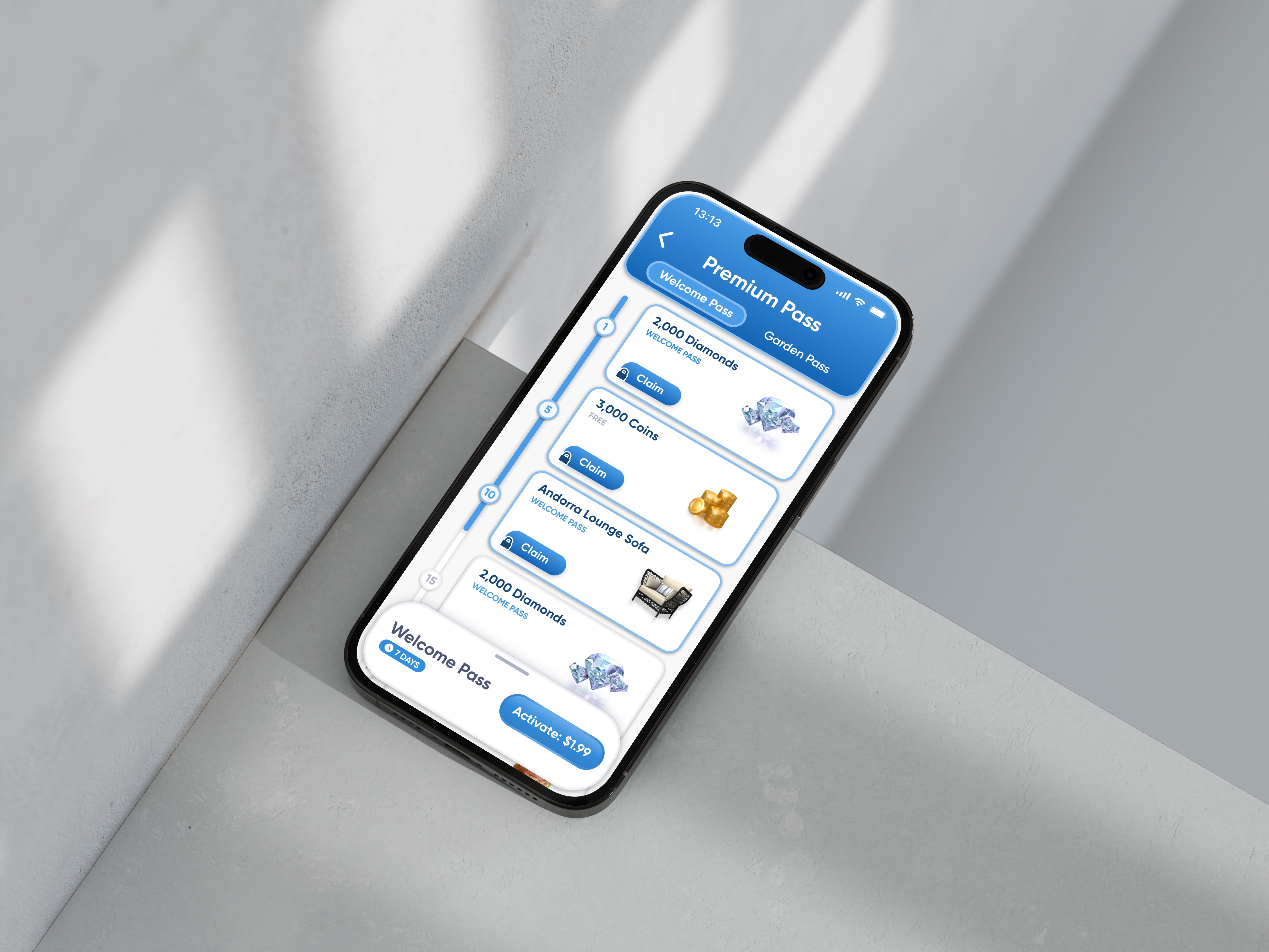
Full screen page for the plans
I replaced the old pop-up with a full screen page. The feature should feel more permanent and accessible.
Combined reward tracks
The goal was to reduce the learning curve and create a healthy FOMO.
The flow is simplified to reduce as much friction as possible.
Both plans are now live on a full screen page
Combining the reward tracks makes premium value front and center.
FINAL DESIGN

RESULTS & IMPACT
Positive impact on set goals.
in new user conversion
in weekly engagement
of Garden Pass buyers have purchased the Welcome Pass
in revenue growth from new users
