
Overview
The Last of Us Part II focuses on delivering an interactive cinematic experience, and the UI design reflects that goal. It stays minimal, functional, and mostly invisible, surfacing only when needed to support gameplay without interrupting the flow. The interface complements the narrative tone, prioritizing clarity and immersion over flash.

The UI is clean and minimalistic, making the experience feel like watching and interacting with a movie.
Strengths
Minimal Distraction: The clean, monochrome interface allows the story to take center stage. Inventory and weapon wheels fade quickly, and even health bars are discreet. It all feels cinematic without compromising clarity.
Contextual Interaction: Button prompts appear only when needed, reducing UI clutter and reinforcing immersion. The game trusts players to explore without constant handholding.
Thoughtful Feedback: Subtle audio cues and haptics enhance every interaction; crafting, healing, swapping weapons, delivering rich sensory feedback without over-explaining.
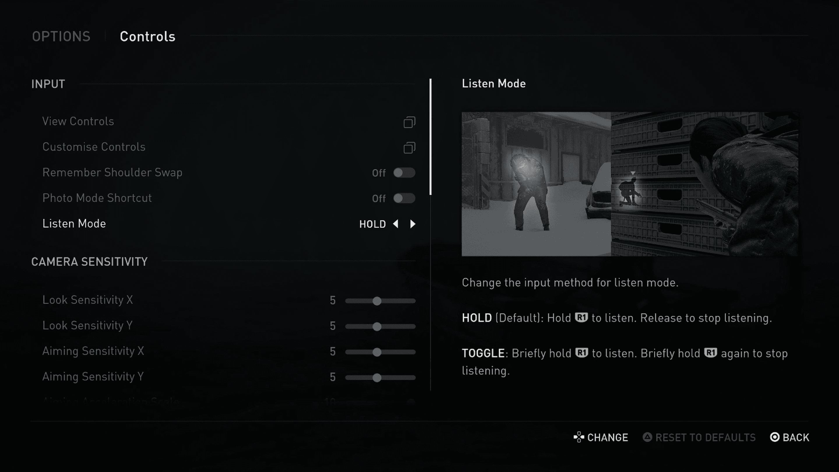
When Listen Mode is activated, the UI gently dims and a soft swooshing sound plays. It’s a subtle cue that enhance the experience without distraction.
Clarity & Usability
The UI is easy to read and navigate, even for players unfamiliar with action-heavy titles. Inventory management feels natural, with simple iconography and quick-swap options. In high-pressure moments, mid-combat or mid-crafting, the system supports muscle memory over micromanagement. The pause in real-time while using the weapon wheel or backpack gives less experienced players much-needed breathing room.

The mechanic is relatively simple, complemented by an intuitive upgrade system and a well-organized inventory.
Accessibility & Customization
Naughty Dog went all-in on accessibility, and it shows. TLOU 2 has a ton of settings covering visuals, audio, and controls, but what stood out to me most were High Contrast Display Mode and Slow Motion in combat.
These features were designed for accessibility, but they ended up helping less-skilled controller players (or maybe just me). Combat became easier to follow, enemies were easier to spot, and I didn’t feel overwhelmed in fast-paced moments. It reminded me of the curb cut effect, something made to help a specific group that ends up benefiting everyone.

The high-contrast display made the gameplay much easier for me, as someone who’s not great with a controller.
Areas for Improvement
Map-lessness: The game doesn’t include a full map, which adds to the realism and tension, and for the most part, it works. But there were moments when I just wanted to fully explore an area and ended up completely lost. Without clear landmarks or a way to track where I’d already been, it got a bit frustrating at certain parts of the game. The game is relatively linear, so even a simple trail or optional map overlay could’ve helped without breaking immersion.
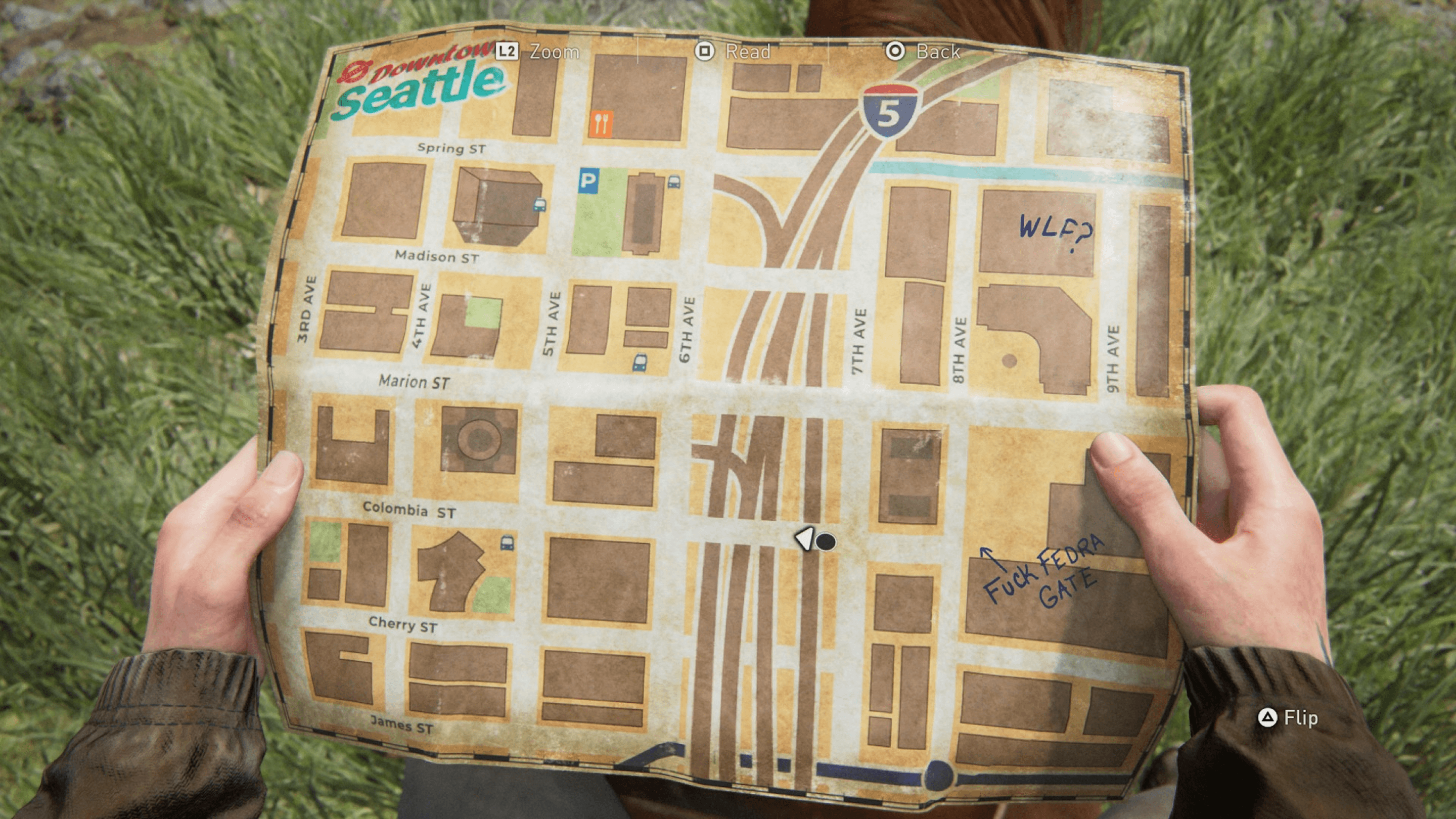
Only certain parts of the game include a map. While it’s rarely necessary during regular gameplay, having one available would be helpful for players aiming for 100% completion.
Final Thoughts
The UI in The Last of Us Part II isn’t trying to be flashy — it’s quiet, focused, and out of the way, which totally fits the tone of the game. But under the surface, there’s a lot of smart design happening. Between the clean visuals, solid usability, and standout accessibility features, it ends up being a great example of UI that enhances the experience without ever stealing the spotlight.