
Overview
God of War: Ragnarök is a cinematic action-adventure rooted in Norse mythology, blending intense combat with emotional storytelling. The UI supports precision, progression, and narrative flow without overshadowing Kratos’ journey, using texture-rich design and subtle color-coding to balance immersion and complexity.
Strengths
Integrated visual identity: The UI reflects the Norse world with stone textures, glowing glyphs, and cold metals, blending seamlessly into the game.
Combat readability: Crisp health bars, cooldowns, and enemy markers keep players focused and aware.
Menu depth, no overwhelm: Deep systems stay accessible through clear tabs, icons, and layouts.
Smart feedback loops: Snappy animations and haptic/audio cues make every action feel responsive.
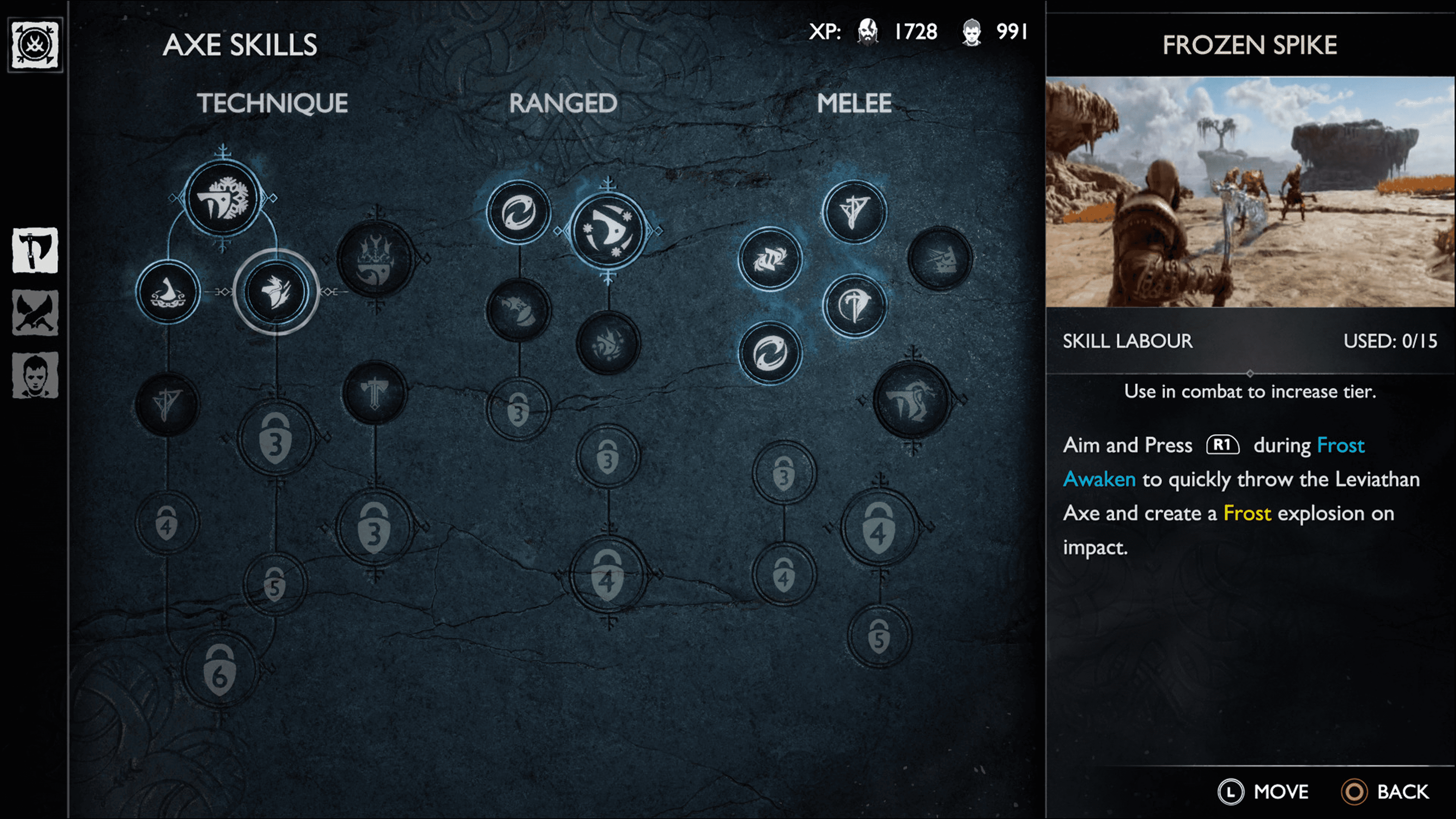
The skill tree stands out. Simple, intuitive, and aligned with the Norse aesthetic.
Clarity & Usability
While the menus are layered, they’re logically structured. The main HUD is minimalist, surfacing only what’s necessary: health, rage, compass, and contextual prompts. In combat, quick-time-event indicators and status effects are bold without being intrusive.
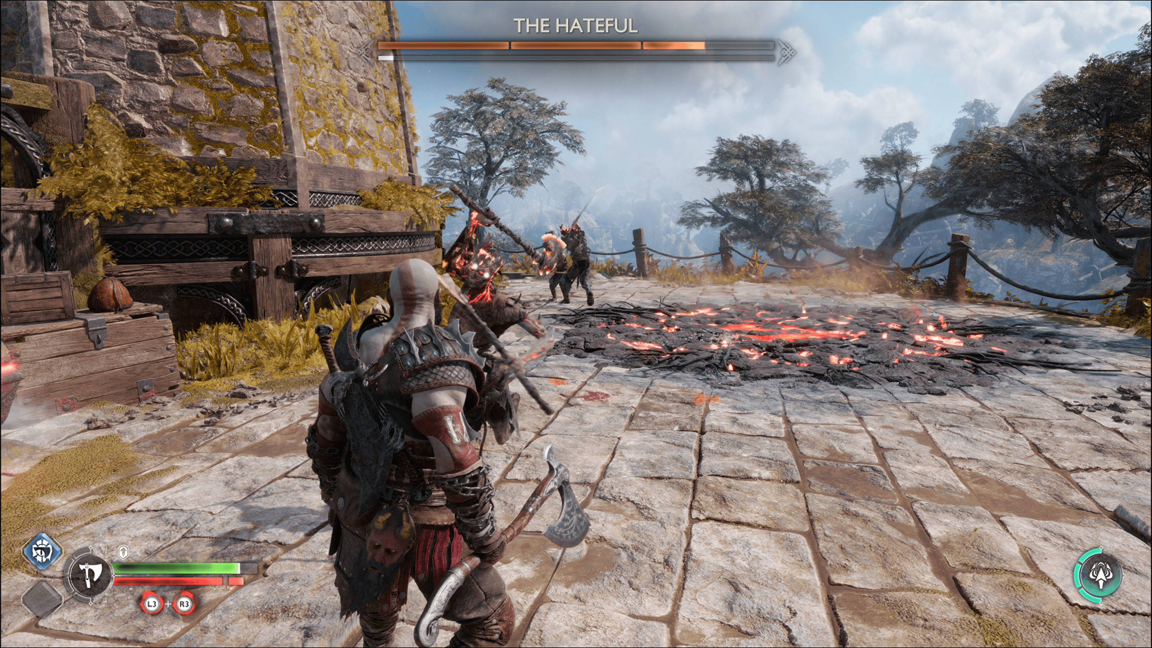
Layered yet logical menus, with a minimalist HUD that shows only essentials.
That said, stat-heavy systems like runes, enchantments, and gear traits lean a bit too deep into numbers. There’s a lot of comparative judgment required, and visual cues don’t always help distinguish major upgrades from minor tweaks.

Personally, it took me some time to get used to the numbers in the UI, since they represent a mix of things like currency, stats, cooldowns, levels, and more.
Accessibility & Customization
Santa Monica Studio went above and beyond in this area. The game features:
Fully remappable controls
High-contrast mode
Visual indicators for audio cues
Navigation assistance for players with spatial impairments
Adjustable subtitle presentation, including speaker names and direction indicators
It’s one of the most robust accessibility suites in a AAA game to date, and a model for the industry.
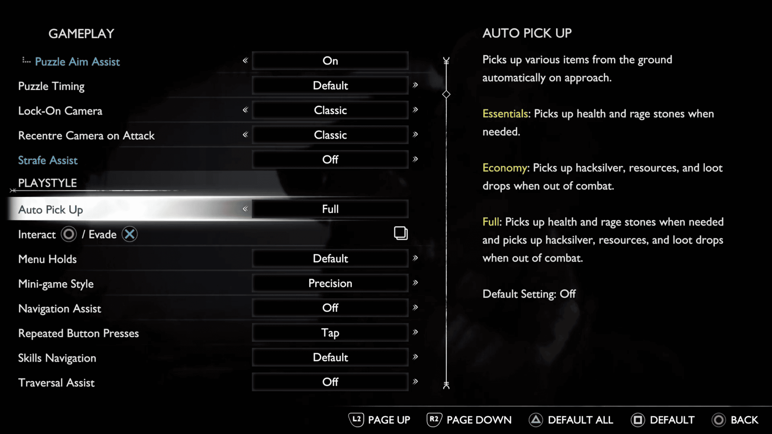
God of War Ragnarök offers a wide range of accessibility options, and the Auto Pick-Up feature has made my gameplay much smoother and more enjoyable.
Areas for Improvement
Information density: Gear and skill menus sometimes overwhelm with stats, nested options, and small text. Even with tooltips, comparing equipment can feel like spreadsheet work. It was a challenge for more casual players.
Gear Comparison Fatigue: Even with visual markers for upgrades, the gear comparison system demands a lot of cognitive load. Browsing through multiple stat categories, traits, and passive effects across similar items slows decision-making and adds friction to progression.

The gear menu options can sometimes get nested in a way that makes it difficult to navigate between equipped, upgradable, and craftable items.
Final Thoughts
God of War Ragnarök’s UI is a brilliant example of immersive, mythic design. It feels grounded in the brutal world without pulling you out of the experience. The game manages to juggle cinematic storytelling and real-time control in a way that makes even complex systems feel approachable. Gear management can still get a bit clunky and overwhelming, but overall, it’s one of the best examples of user experience in a modern AAA title.