Problem Statement
🔍 Finding
The core Garden Pass is a monthly progression-based feature offering rewards as players complete challenges. However, we noticed a consistent issue:
New users joining late in the month were significantly less likely to purchase the pass.
This led to lost revenue, lower early retention, and weaker engagement onboarding.

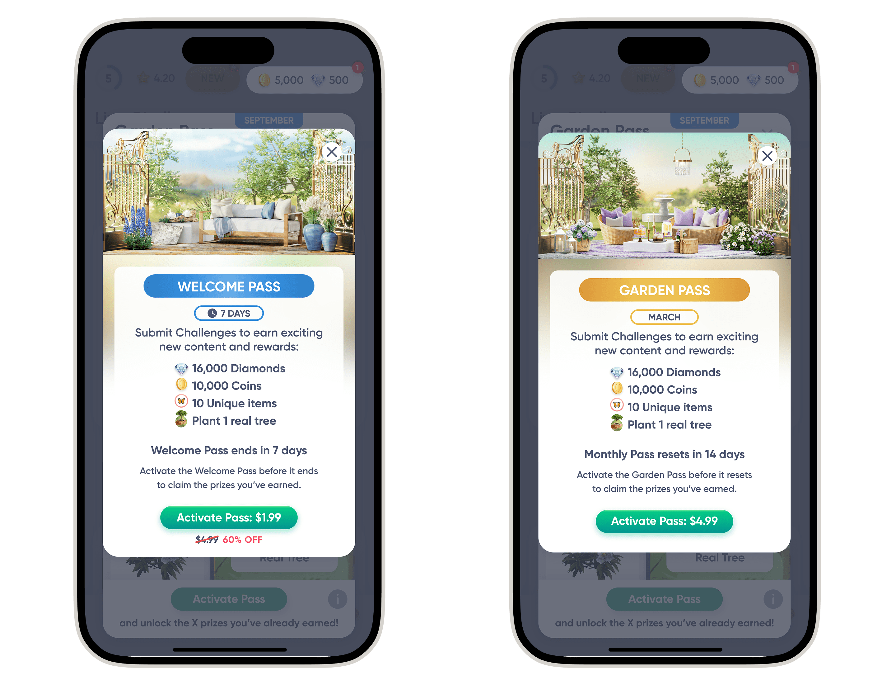
Left: Existing Garden Pass reward details. Right: New reward tracks, Free (left) and Premium (right).
This behavior made sense. Players who joined mid- or late-month felt they had too little time to earn enough rewards, making the purchase feel poor in value.
🧳 Business Impact:
We were leaking high-intent new users from one of our primary monetization funnels within their first week, when engagement is most crucial.
Goals & Constraints
🎯 Goals:
Increase conversion rate of new users into Garden Pass purchasers
Drive early retention by giving players compelling early rewards
Avoid confusion or perceived unfairness in pricing and pass mechanics
🔒 Constraints:
Garden Pass progression is challenge-based, not calendar-based
UX needed to accommodate two concurrent passes without overwhelming players
Avoid price anchoring issues (e.g., new users seeing inconsistent pricing month to month)
Exploration & Challenges
💡Exploration Phase: Alternatives Considered
We explored:
Prorated rewards on the main pass → Too confusing (progression ≠ time)
Reduced reward pool → Poor user perception, hard to message
Discounted late-month pricing → Hurt long-term LTV, set confusing pricing expectations
These options all risked compromising clarity, fairness, or long-term revenue.
Final Design & Decisions
✅ Final Approach: Introduce a Parallel, Time-Limited Pass
We introduced a new “Welcome Pass”:
Available only to new users
Runs for 7 days from install date
Lower price, tuned to 7-day progression goals
Runs alongside the main monthly pass
This gave players agency: they could buy one, both, or neither, and claim free rewards from both tracks.
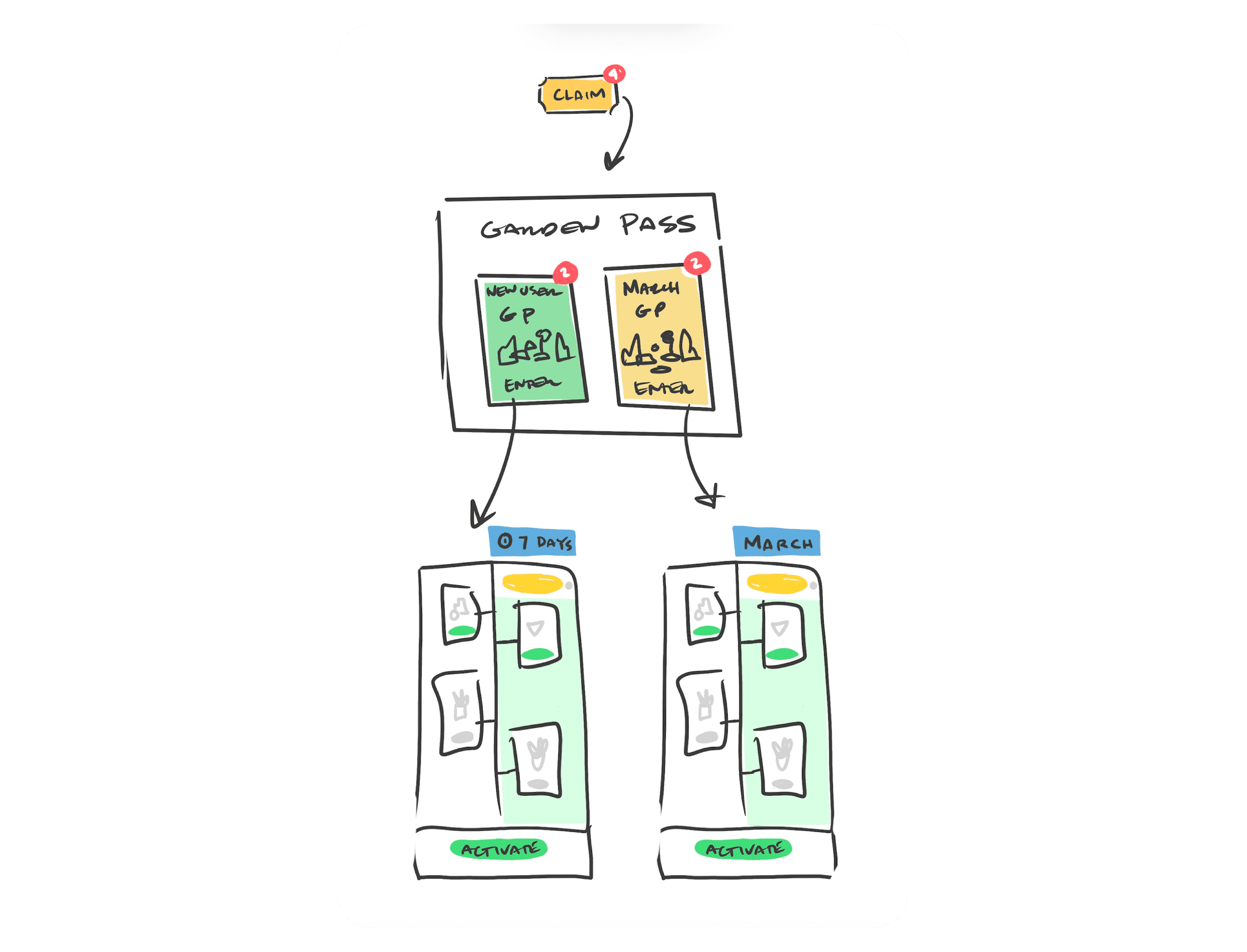
Early concept of the Welcome Pass.
🎨 UX Execution: Simplify + Differentiate
The biggest design challenge: visual and conceptual clarity.
Players had to understand they could earn from both passes for free
Encourage purchase without creating FOMO overload
Needed clear visual distinction between the two passes, and strong value cues

New users first see a prompt to select a pass, followed by a brief pop-up highlighting the respective timeframes.

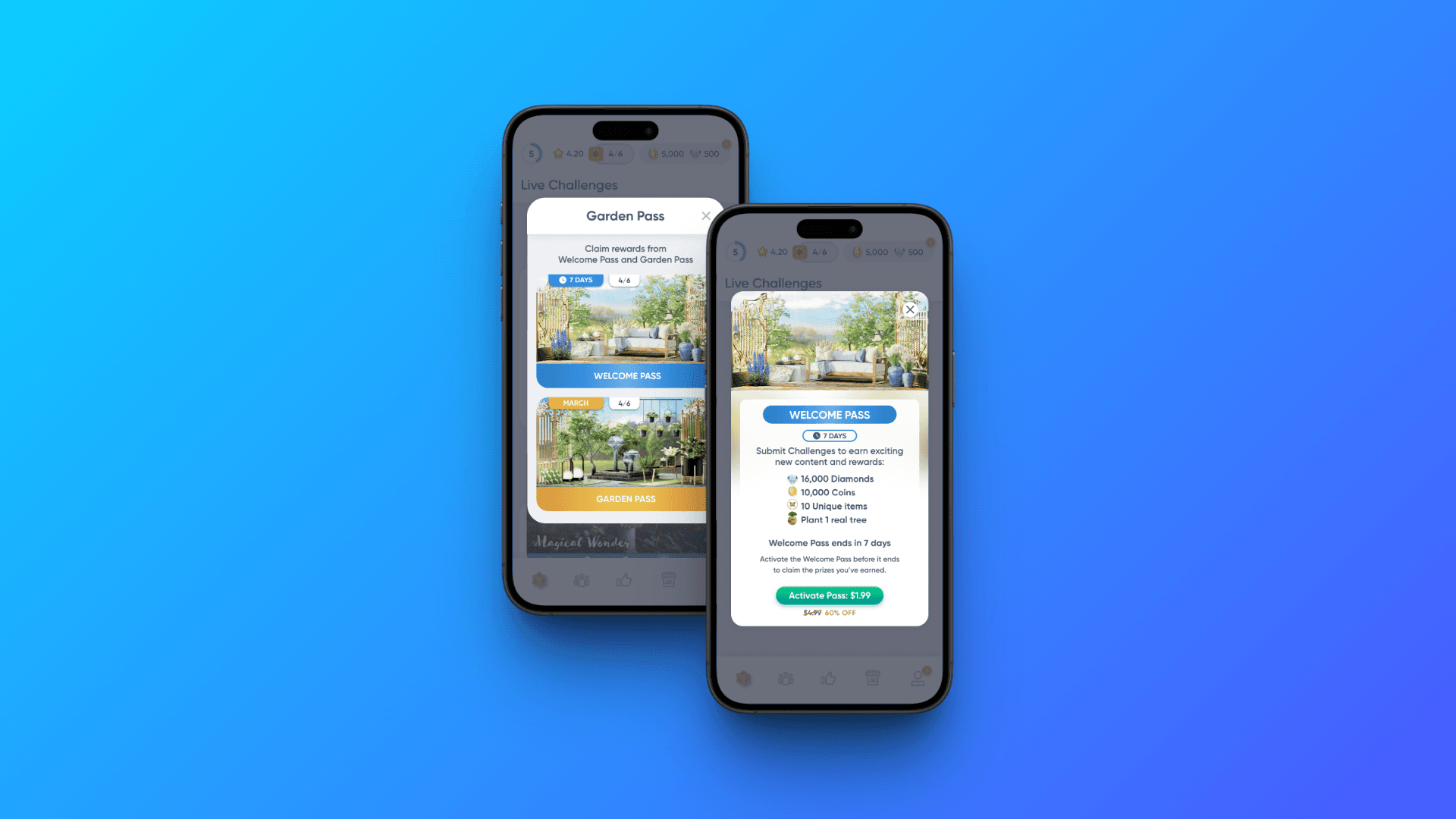
The reward tracks now feature the corresponding theme colors of each pass.
The reward detail pop-ups have been refreshed with a new look.

The Garden Pass entry point in the header now shows progress toward the next reward. A golden ring appears with the Premium Pass to highlight status and enhance the premium feel.
♻️ Discarded Concepts
I proposed a “Help Me Choose” button to guide new players. It was ultimately cut. Likely due to concerns about adding friction or drawing attention to indecision. The team prioritized immediate visual clarity and simplicity over guided comparison.
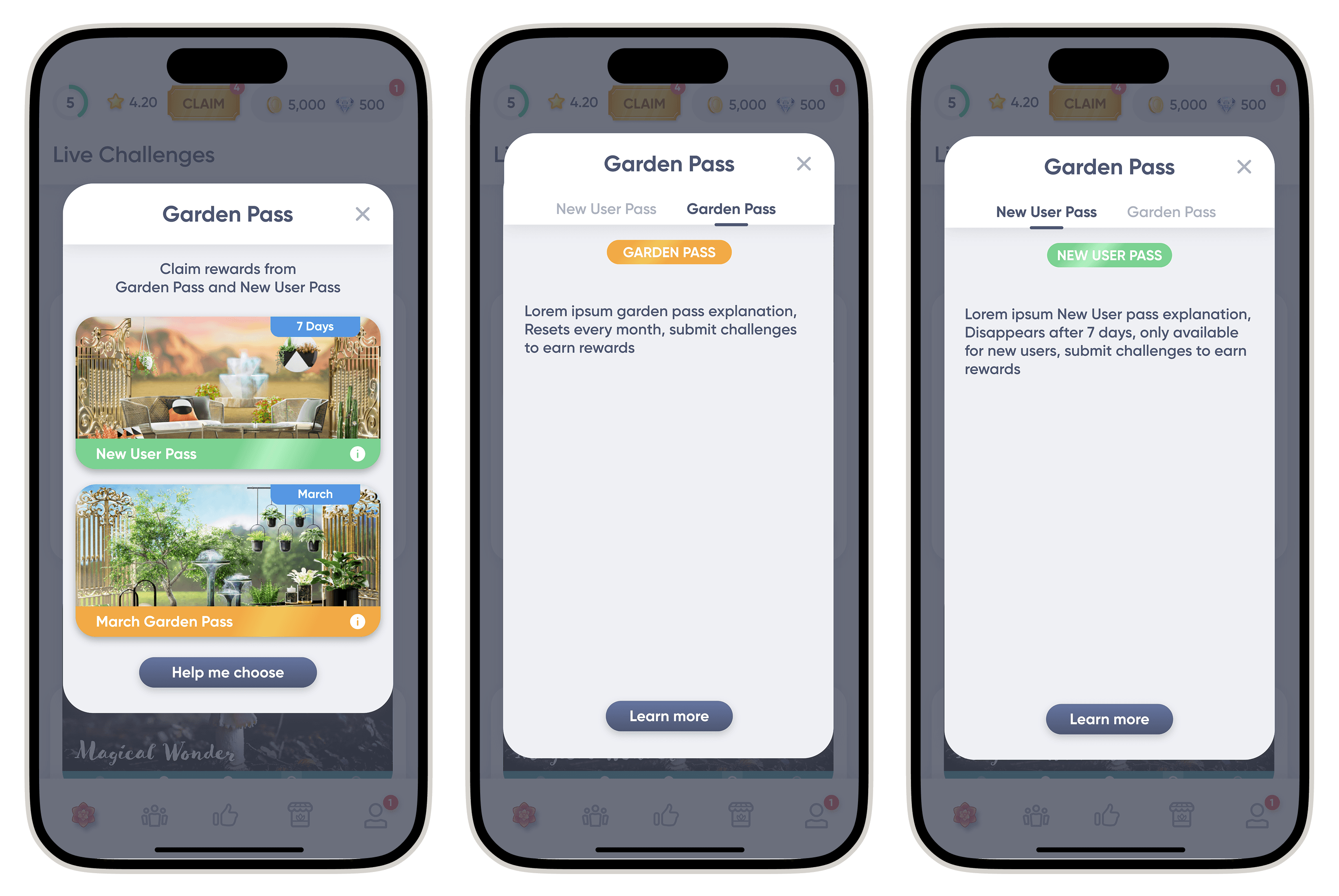
The ‘Help Me Choose’ flow was removed to reduce indecision.

I also explored a concept with more distinct gradients to emphasize the difference between the two reward tracks, but it was ultimately cut for not aligning with Garden Joy’s brand feel.
Outcome & Results
📈 Impact
Improved player perception of fairness and choice
Positive qualitative feedback on being “welcomed” with a tailored offer
Strong player sentiment around value alignment and timing
💯 Metrics
While I cannot disclose the exact revenue impact due to NDA restrictions, I can share that the feature resulted in:
A significant increase in early monetization among new players
Improved conversion from first-week players to paying users
A measurable rise in player regularity, with more users returning across their first 7 days
This feature ultimately validated that strategic segmentation and pricing timing . When paired with a clear UX, they can yield strong business results.
Reflection & Takeaways
🤔 Learning
Strategic clarity beats clever UX tricks. Success came from nailing the product structure more than from visual flourish.
Balancing monetization and UX means thinking in terms of value, perception, and trust, especially during onboarding.
While I was proud of the “Help Me Choose” concept, this taught me to recognize when less is more. Sometimes clarity isn’t about explanation, It’s about strong defaults and confident framing.