Design Process
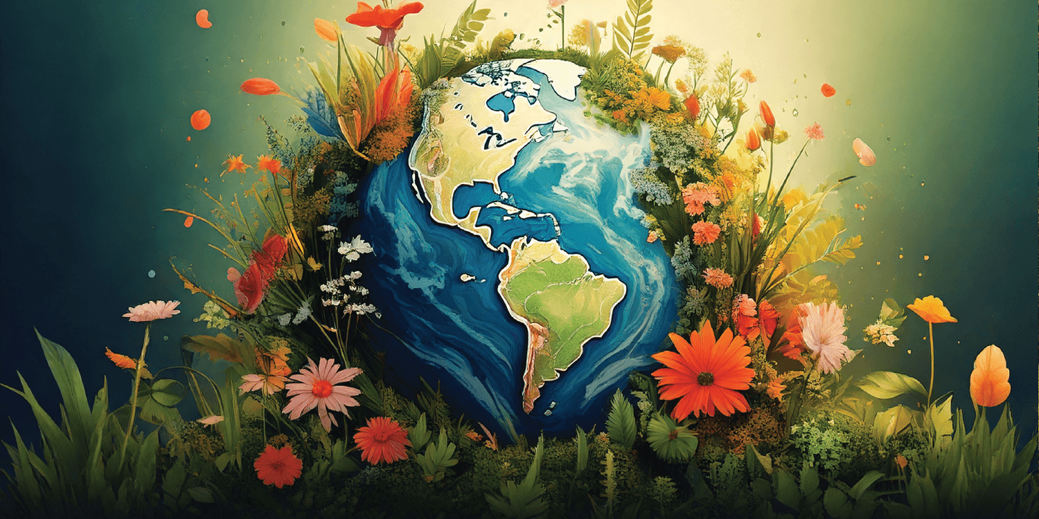
🍃 Mood Board
I started with a mood board and event brief from the content team. The goal was to create something that felt warm, springy, and full of life, like a garden just starting to bloom. That tone became my direction throughout the process.
🆎 Typography
Before touching the background, I focused on getting the headline right. I tested different fonts and layout options to find something that felt soft, seasonal, and elegant. Something that matched the mood without overpowering the image.

I experimented with overlapping two very different fonts for the headline. The goal was to create contrast without losing cohesion.
🏞️ Background
With the text in place, I moved on to the background. I played with different elements and natural sceneries that felt grounded in nature. I wanted the image to feel fresh and tied to the Earth, without being too literal or cluttered.
First iteration of the background. Feedback noted it felt too cartoony and lacked a natural, spring-like feel.

Second iteration, added trees and buildings for realism, but the scene still feels too arid and not vibrant enough.

Third iteration, much warmer and closer to what the content team and I envisioned.
🔬 Refinements
After locking the layout, I made smaller tweaks to bring the piece to life — adjusting the sky, adding wildflowers, and fine-tuning the lighting and hue. These changes helped push the “blooming” vibe and tie everything together visually.

I first adjusted the color and hue of the grass, trees, and water to give the scene a more spring-like appearance, shifting it away from the original fall tones.

I then added wild flowers on the grass so the image looks more vibrant and lively.
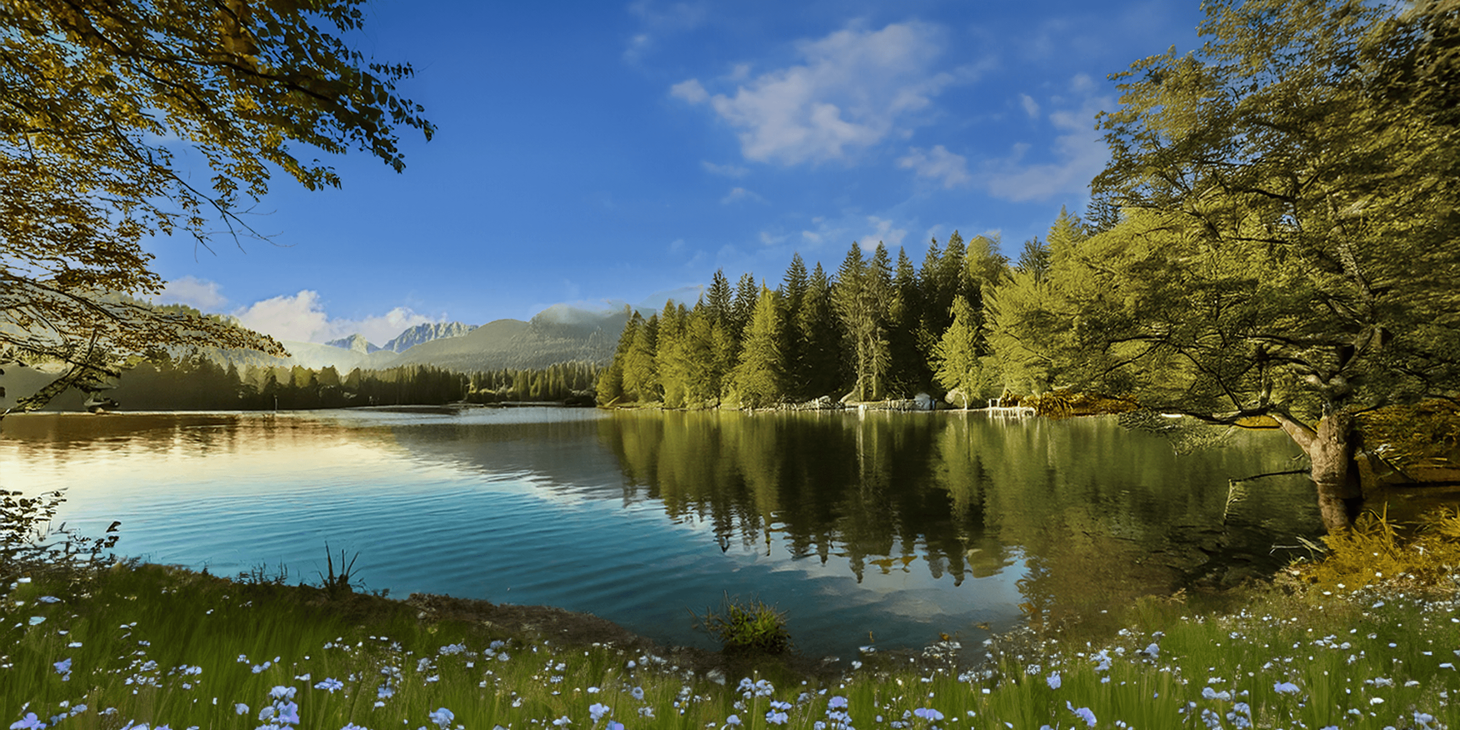
| I then adjusted the sky to make the clouds more visible and to better complement the wildflowers.

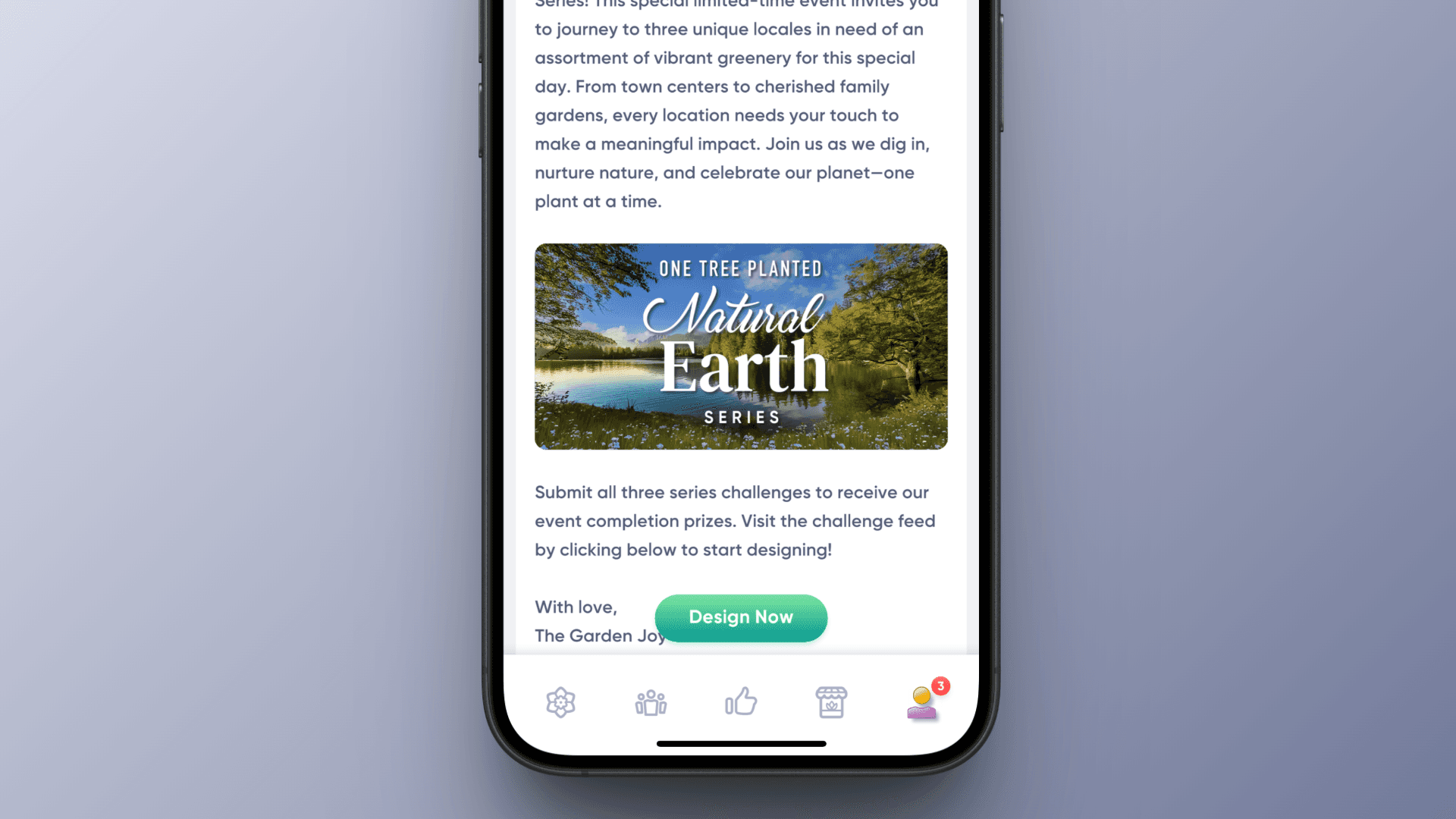
Lastly, I added the text I created, bringing everything together in the final version.

The image went live!!
Takeaway
💭 Reflection
This project was a refreshing break from systems and flows. It was all about mood, layout, and getting small details to click. I enjoyed shifting gears into 2D graphic design and contributing to the in-game content side of Garden Joy. It’s rewarding to shape how players first experience an event.